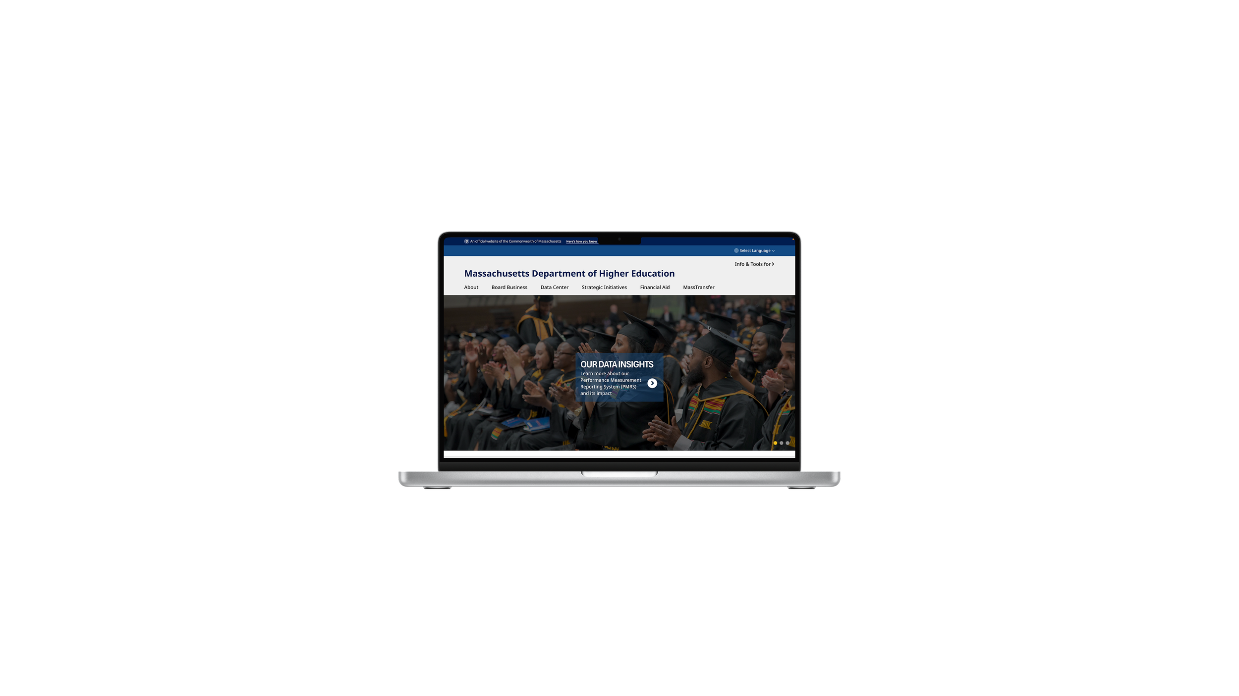
Digital Modernization and Accessibility Updates for the Massachusetts Executive Office of Education (EOE)
Timeline: August 2025 – present
Role: UX/UI Developer & Product-Oriented Modernization Analyst
Type: Web Design
My role
Currently modernizing:
Department of Higher Education (DHE) website (mass.edu)
School and District Profiles website (https://profiles.doe.mass.edu/)
Retirement Plan Management System (RPMS) internal platform
by updating layouts and UI components (in accordance with the new Massachusetts Design System) and ensuring front-end and back-end are WCAG 2.1 Level AA accessible.
These mockups are drafts of the websites and visually different from the final designs, which are unpublished and confidential. The RPMS platform is currently being updated with the drafts I created that became final designs and unable to be shown to the public.
For the DHE website, I updated the site components with their respective Massachusetts Design System components (e.g. header, footer), making it consistent with other mass.gov websites. I also updated the layout to make the web content more readable and accessible by adding/reducing whitespace and changing how information was being presented (e.g. long sections vs accordions). In addition, I ensured that the designs were responsive so it could be accessed on desktop or mobile.
DHE Website
Homepage
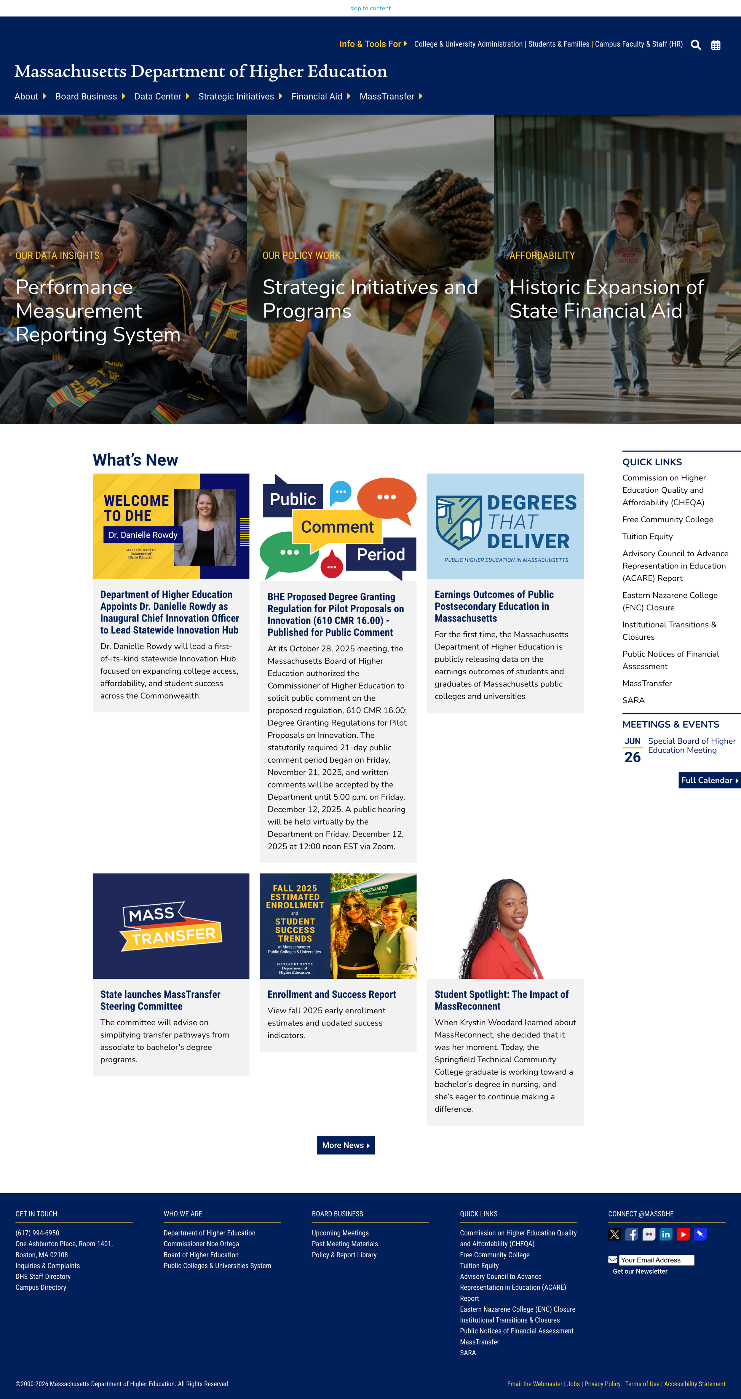
current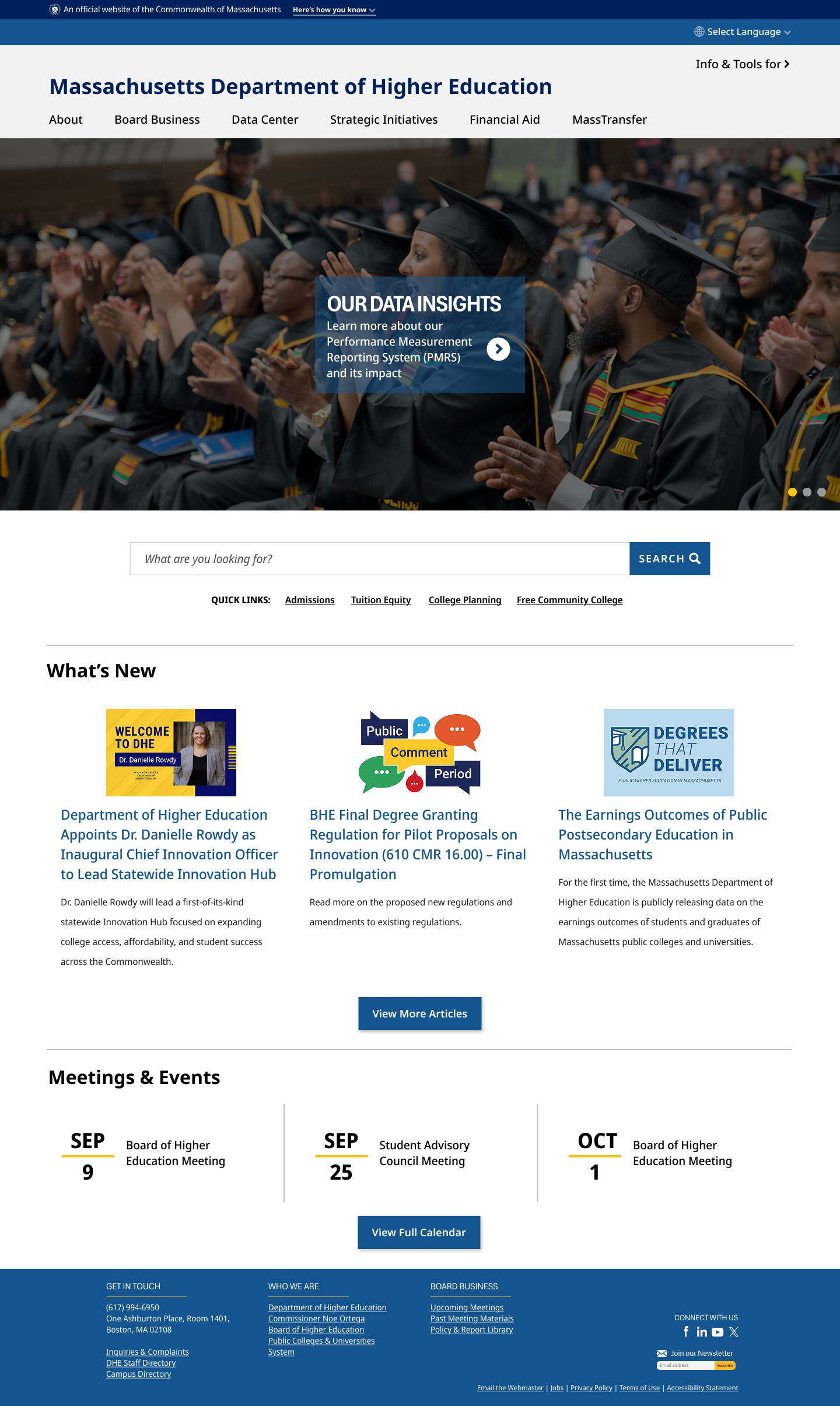
v1About page
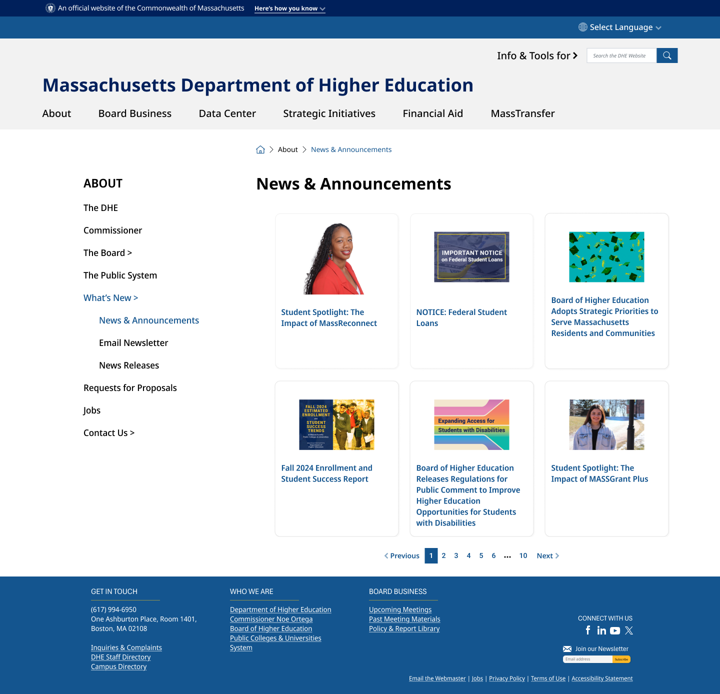
current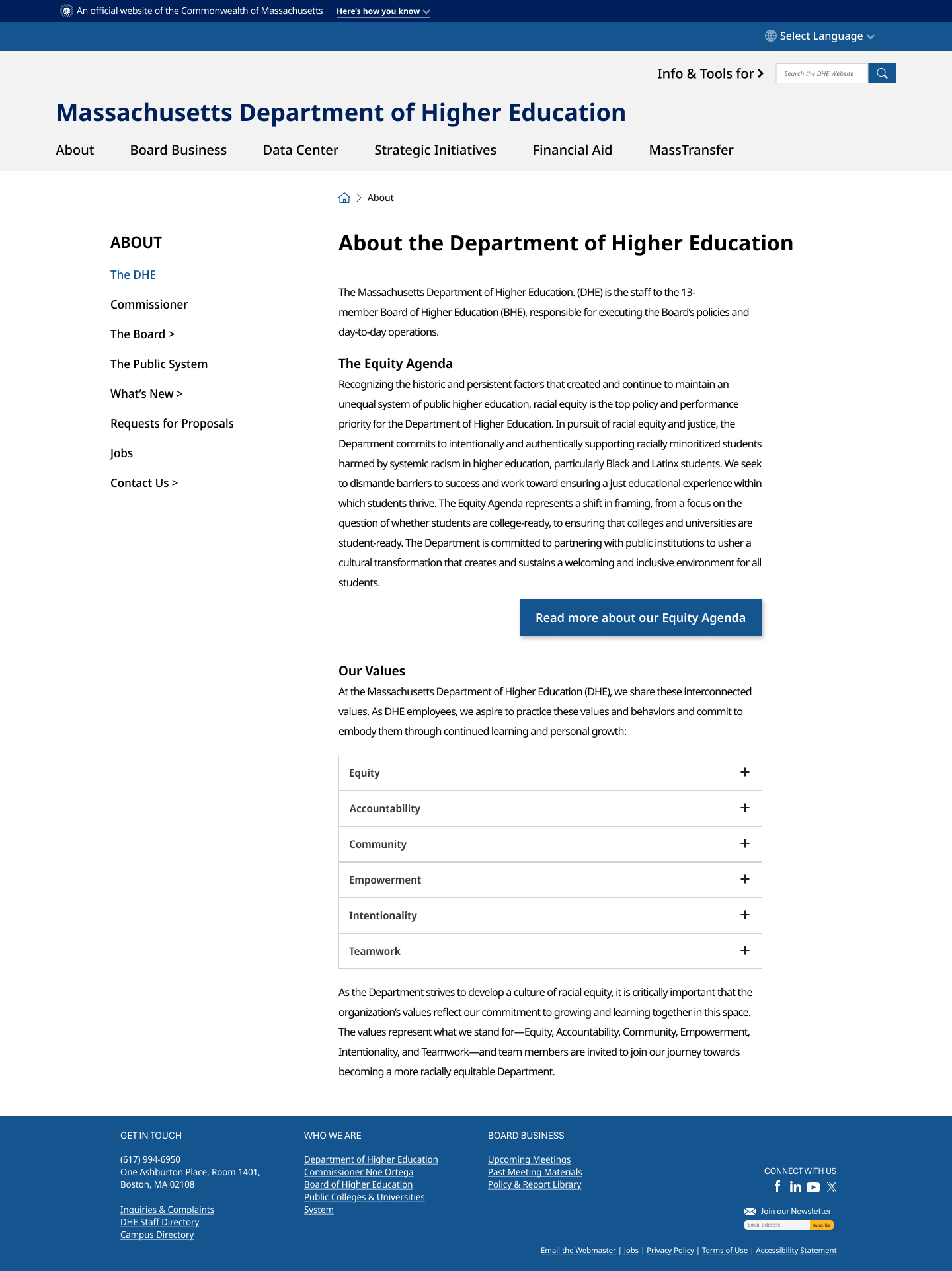
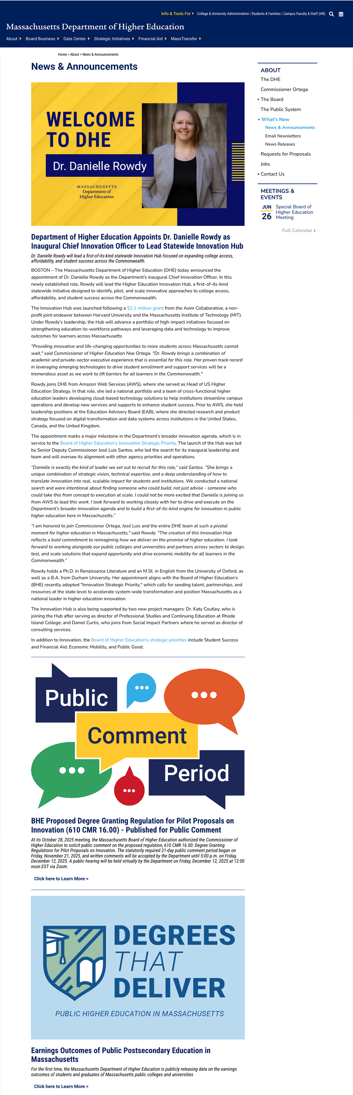
v1News & Announcements
currentv1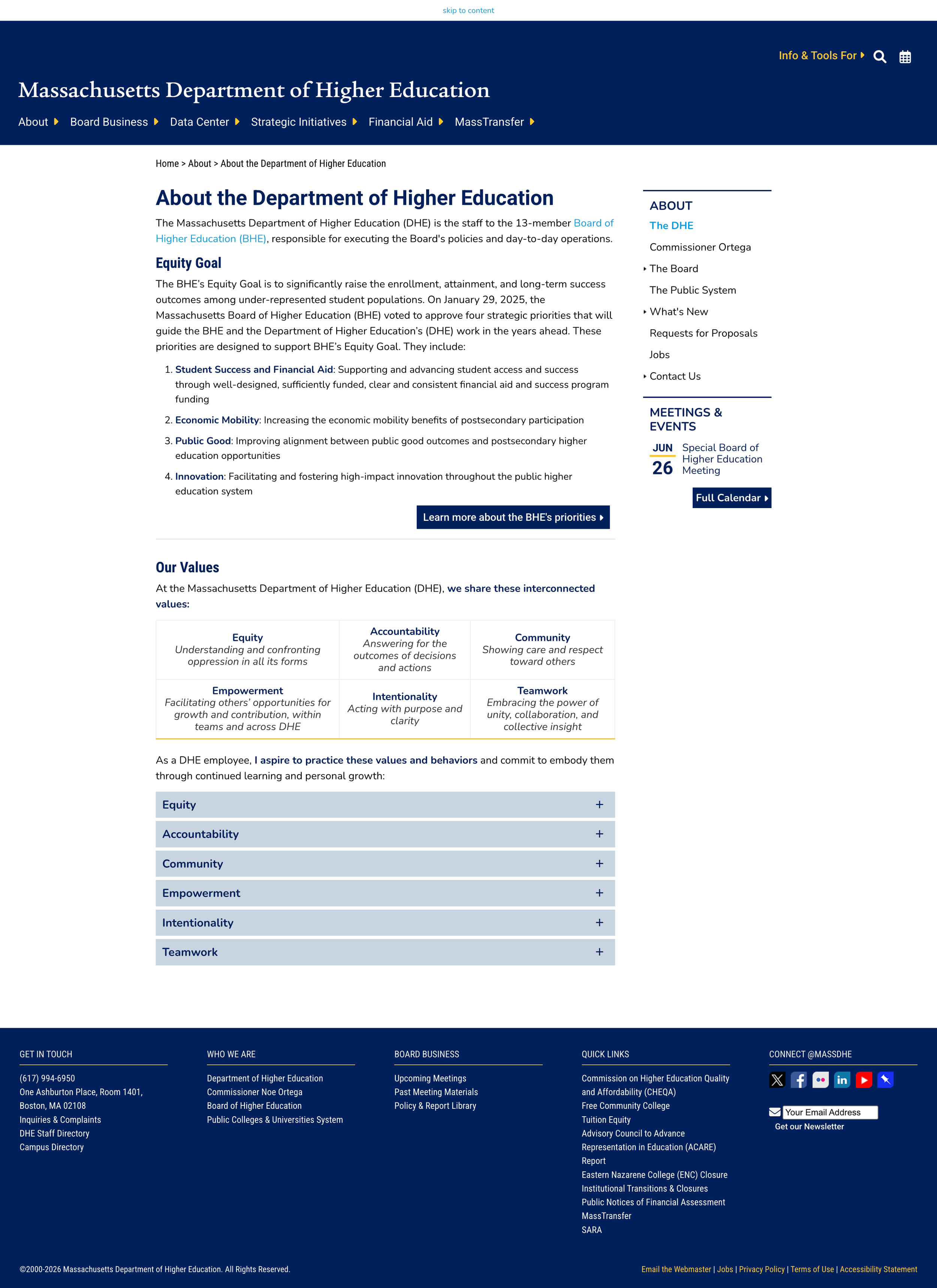
(one long page of all news articles)School and District Profiles Website
The design of the School and Districts Profiles website has not been updated for over a decade, so I was able to redesign the site from scratch essentially. I modernized the site with all new/updated the site components from the Massachusetts Design System. I focused on designing the School and School District pages (and their subpages), prioritizing accessibility, readability, and consistency (with the rest of the site + MA Design System).
Current Boston school district page vs redesign options
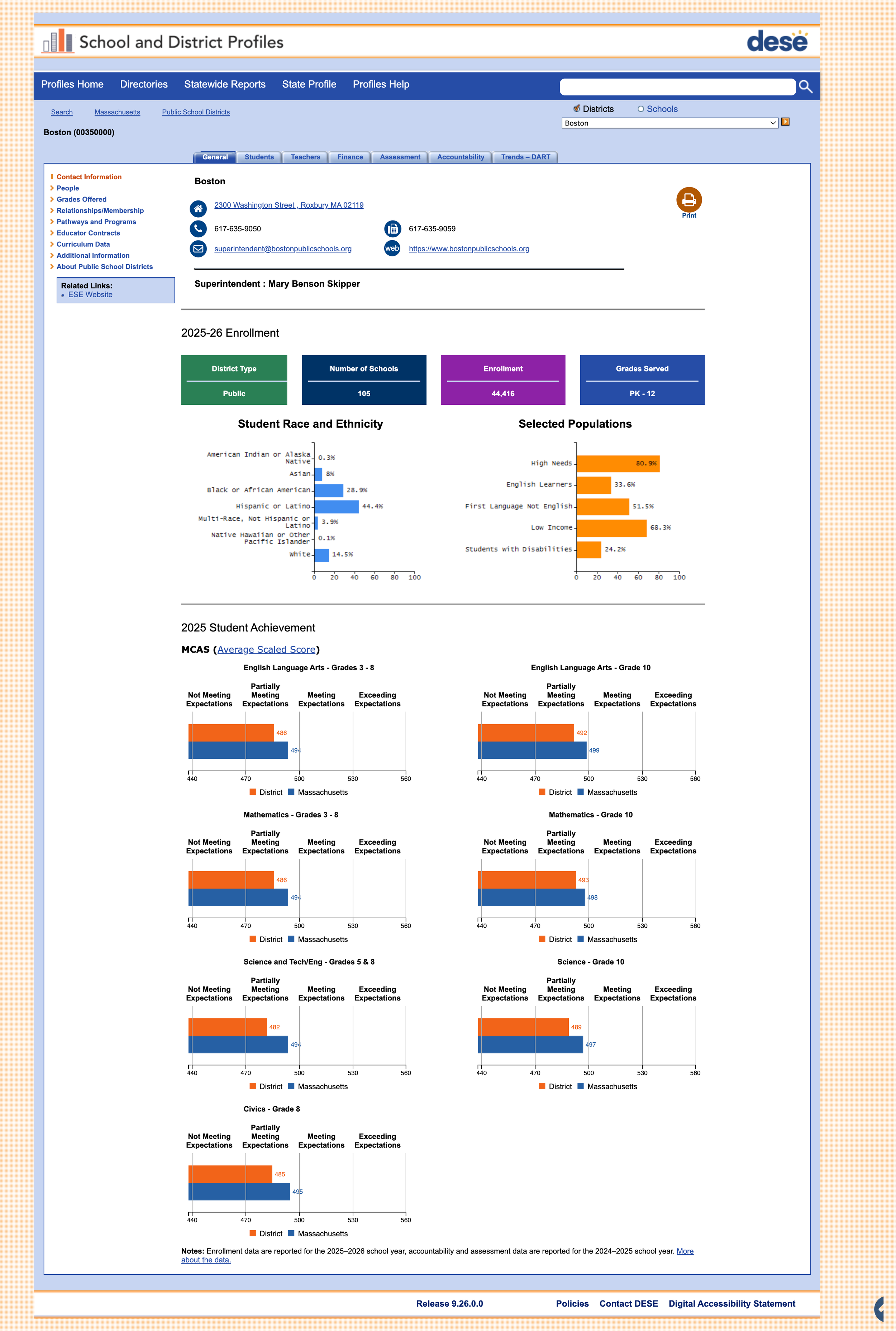
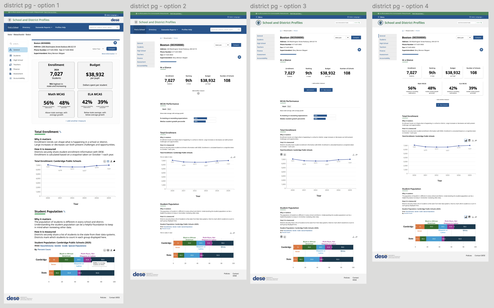
The School District pages display key information and statistics about each school district in MA. At a glance, the current site is crowded and hard to read, especially skim over for key insights and numbers. I wanted to create a layout that’s
easier to read because there’s enough space between grouped elements but not so much that it’s hard to gather information
grouped into intentional sections with statistics or graphs rather than having many graphs in one big section
more descriptive with text detailing why this information matters + how the information was collected so that users can understand the numbers they’re looking at on a graph in plain language
Current Boston school district subpage (Students) vs redesign options
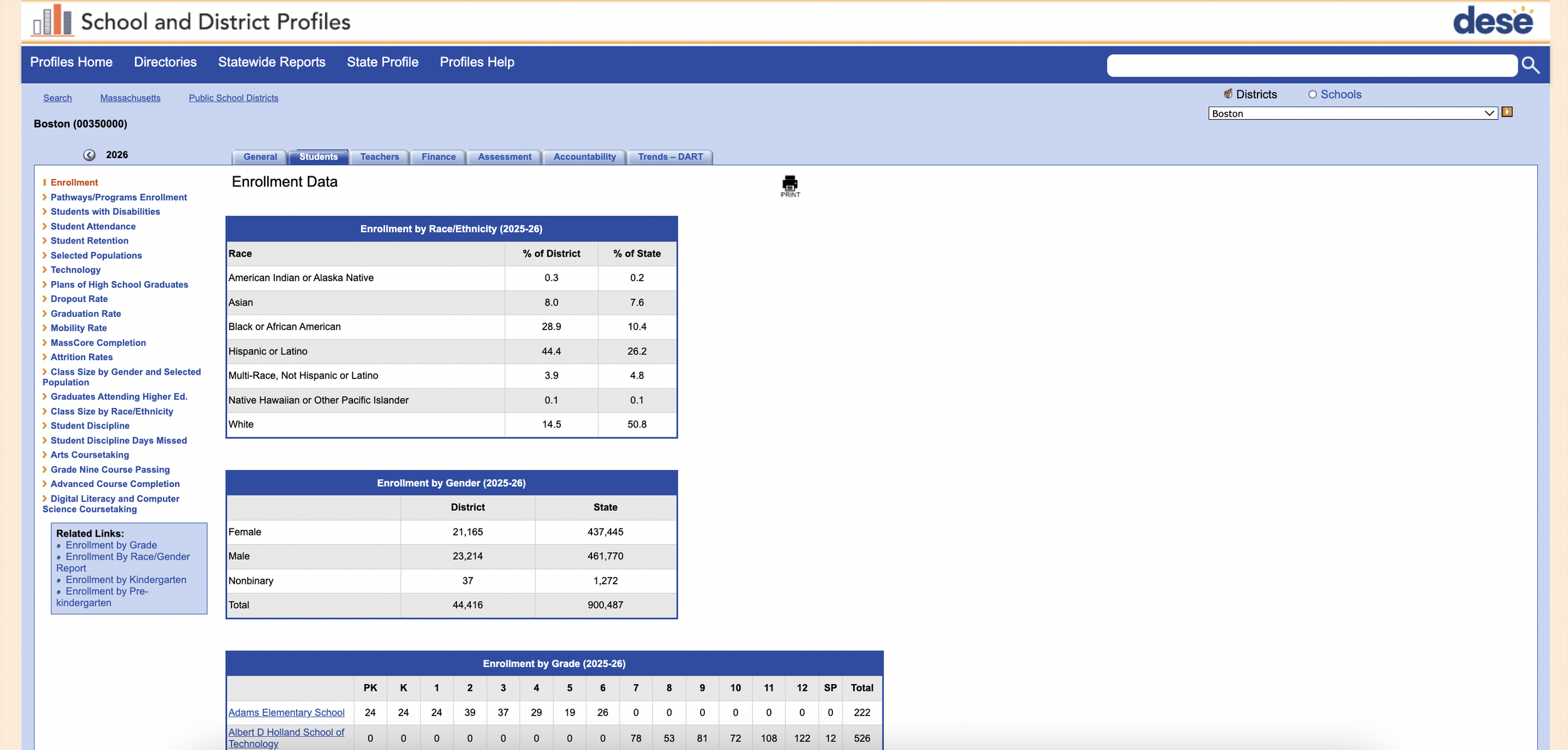
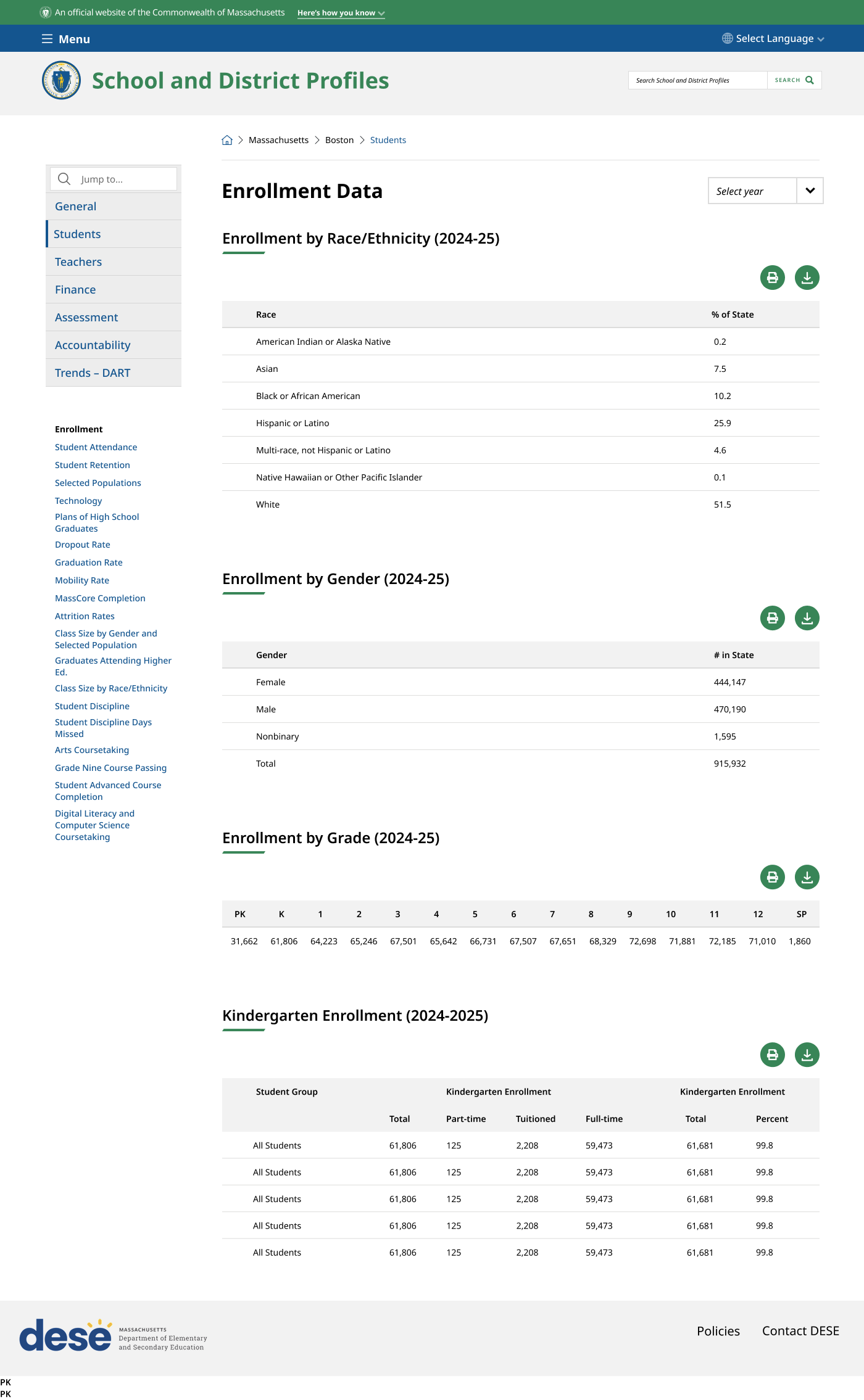
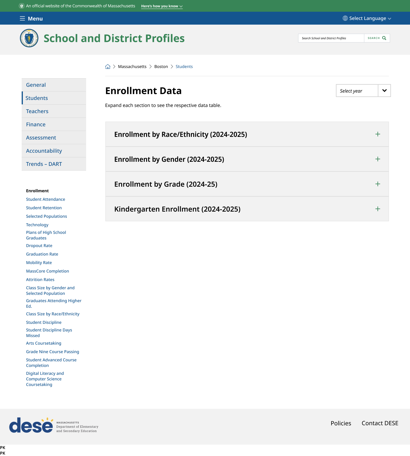
The School District subpages all have the same template, as these pages only contain tables. The page above is the Students subpage which has been appended because the Enrollment by Grade table was too long. The two UI options presented show the tables all laid out on the page and accordions containing the same data, respectively. One significant decision was to only show the enrollment for the page’s school district rather than showing the enrollments for every school district in the Enrollment by Grade table. Only showing the information for the school district page cuts down significant screen space, and is the essential information users need from the entire table.